

Four Best Practices for Donation Pages
Posted by Martha Ormiston on November 12, 2013

Almost every organization has a donate page. But there are major variations in what the donate page looks like, and some are better than others.
Actually, I take that back - some are absolutely terrible. So bad in fact that they're liking leading to less revenue for organizations.
We’ve gone through and looked at dozens of donate pages, and have narrowed down our four best practices, complete with examples to help illustrate our points.
1. Less is more: Aim for a fast & easy user flow
Who has time to read paragraphs of text or fill out dozens of form fields? Make the process quick and straightforward for a user to finish the donation process. The Barack Obama site achieves this by simplifying the donation process down to three simple steps.
2. Use Popups Strategically
J Street’s donate page* contains a lightbox that shows up when a user clicks the “one time donation” radio button. This popup makes the user re-think their decision of a one time donation, and offers an incentive to make a recurring donation.
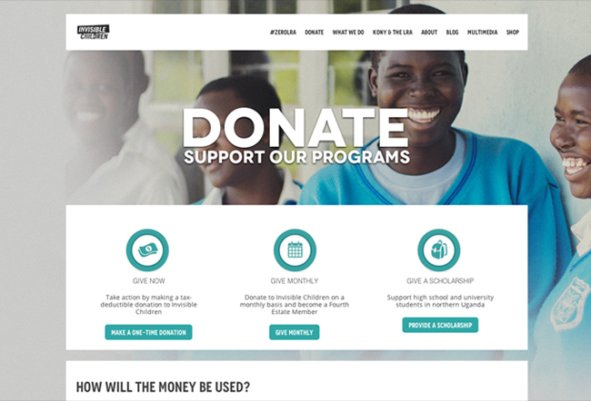
3. Use real images of the people that the donation will impact
Invisible Children’s donate page features young happy children in the background. This shows the user whom they are impacting by donating. These kinds of images are powerful, but be sure to use your own real photos and stay away from stock images.
4. Don’t forget about mobile.
Charity Water** has a beautifully designed mobile view of their donate page. When thinking about mobile, mostly just think logically. The user shouldn’t have to pinch to zoom to read anything, or have issues tapping form fields to input text into. Basically, the main goal is that you don’t want the user to think to themselves “Oh, I’ll just donate later on my computer.” You want them to donate now.
Whether you need a brand new approach to your user flow, or just a refresh on the design, Fission Strategy can help you bring your donate pages up to the level you’d like them to be. Just email us today!
*This page was designed by us at Fission!
**Visit this example on your phone!


Leave a comment